In this tutorial, we will cover how to load demo data from .CSV files into QuestDB and to use this as a data source for a Grafana dashboard. The dashboard will have line charts as data visualizations that make use of aggregate SQL functions and Grafana global variables for sampling data based on dashboard settings.
What is Grafana?#
Grafana is an open-source visualization and dashboard tool for any type of data. It allows you to query, visualize, alert on, and understand your metrics no matter where they are stored. With its powerful query language, you can quickly analyze complex data sets and create dynamic dashboards to monitor your applications and infrastructure. Grafana also provides an ever-growing library of plugins for data sources, panel types, and visualizations.
Grafana consists of a server that connects to one or more data sources to retrieve data, which the user then visualizes from their browser.
The following three Grafana features will be used in this tutorial:
- Data source - this is how you tell Grafana where your data is stored and how you want to access it. For this tutorial, we will have a QuestDB server running which we will access via Postgres Wire using the PostgreSQL data source plugin.
- Dashboard - A group of widgets that are displayed together on the same screen.
- Panel - A single visualization which can be a graph or table.
Setup#
Start Grafana#
Start Grafana using docker run with the --add-host parameter:
Once the Grafana server has started, you can access it via port 3000
(http://localhost:3000). The default login credentials are as follows:
Start QuestDB#
The Docker version for QuestDB can be run by exposing the port 8812 for the
PostgreSQL connection and port 9000 for the web and REST interface. Similar to
the Grafana container, we add the --add-host parameter:
Loading the dataset#
On our live demo, uses 10+ years of taxi data. For this tutorial, we have a subset of that data, the data for the whole of February 2018. You can download the compressed dataset from Amazon S3:
There should be two datasets available as .CSV files:
weather.csvtaxi_trips_feb_2018.csv
These can be imported via curl using the /imp REST entrypoint:
Creating your first visualization#
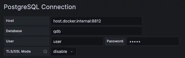
Create a data source#
In Grafana, select to the cog icon to expand the Configuration menu, select Data Sources and click the Add data source button. Choose PostgreSQL plugin and configure it with the following settings:
Note that by default, Grafana does not validate that queries are read-only. This
means it's possible to run queries such as drop table x in Grafana which would
be destructive to a dataset.
To protect against this, we have set the environment variable
QDB_PG_READONLY_USER_ENABLED to true when starting the QuestDB container. Once
this configuration is set, we enable a read-only user, and we could use the
default user (pg.readonly.user = user) and password (pg.readonly.password =
quest) to log in. More details for setting this configuration can be found on
QuestDB's Docker configuration page.
To avoid unnecessary memory usage, it is also recommended to disable SELECT
query cache by setting the environment variable PG_SELECT_CACHE_ENABLED to
false. That's because we are only using Grafana for our queries: Grafana does
not use prepared statements when sending the queries and the query cache becomes
much less efficient. Of course, if you are using other tools on top of this
setup, you will need to evaluate the suitable settings.
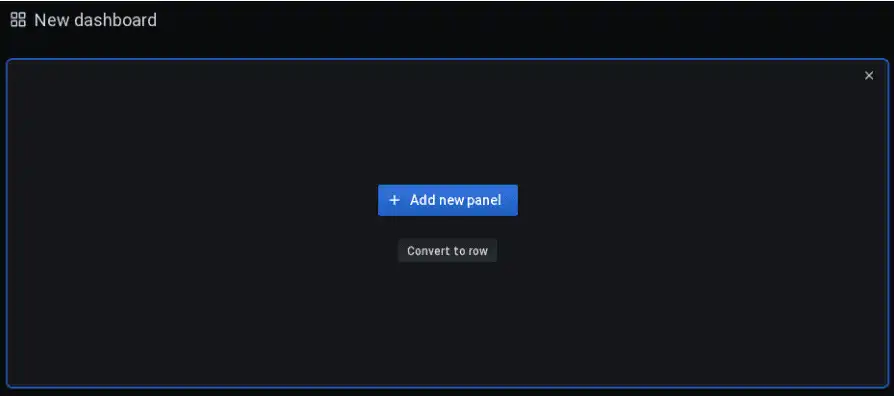
Create a dashboard and a panel#
Now that we have a data source and a dashboard, we can add a panel. Navigate to + Create and select Dashboard:
The new panel has a graphing area on the top half of the window and a query builder in the bottom half:
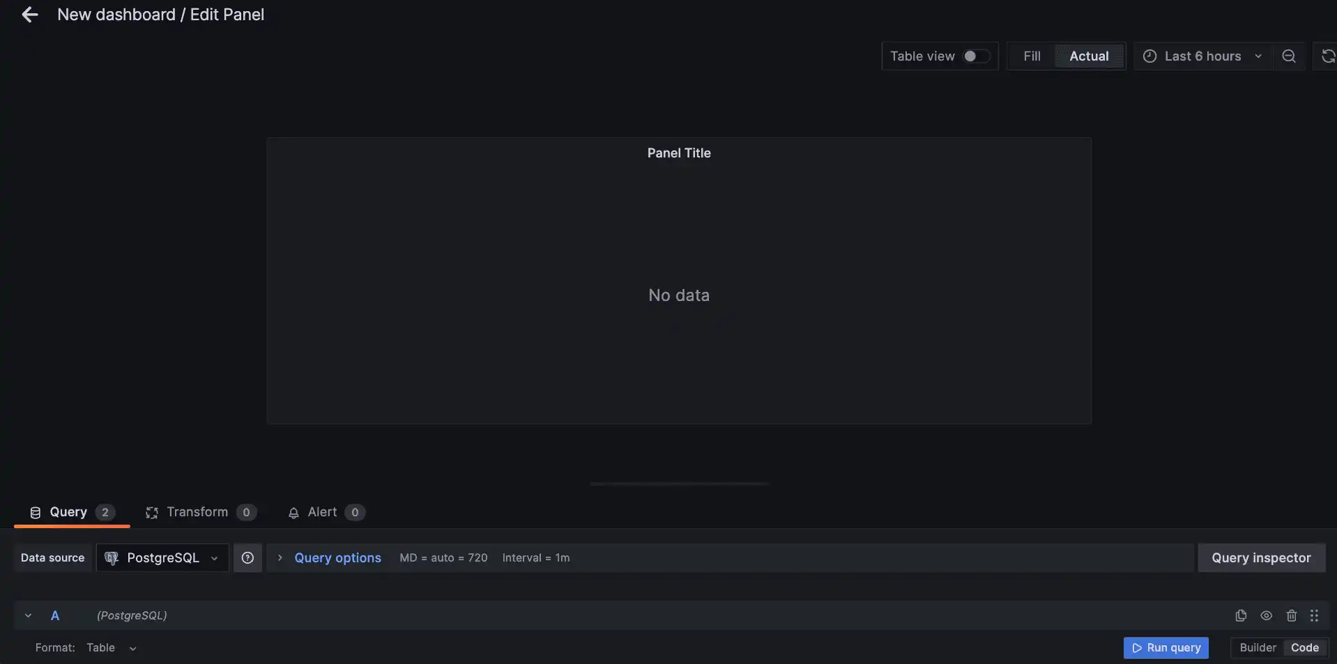
Toggle the query editor to text edit mode by clicking the pencil icon or by clicking the Edit SQL button. The query editor will now accept SQL statements that we can input directly:
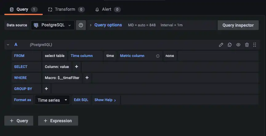
Paste the following query into the editor:
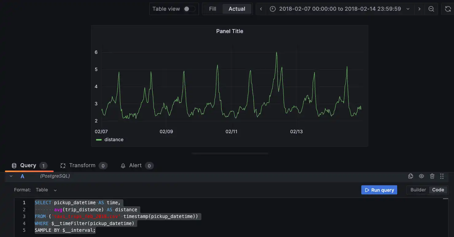
Click the time range selector above the chart and set the following date range:
- Set the From value to
2018-02-07 00:00:00 - Set the To value to
2018-02-14 23:59:59and click Apply time range
We have built our first panel with aggregations:
Query details#
To build a time-series dashboard in Grafana, the results need to be sorted by time. In QuestDB, we typically don't need to do anything as results tend to be sorted already. Check out Grafana time-series queries for more information.
To graph the average trip distance above, we use the avg() function on the
trip_distance column. This function aggregates data over the specified
sampling interval. If the sampling interval is 1-hour, we are calculating
the average distance traveled during each 1-hour interval. You can find more
information on QuestDB
aggregate functions on our documentation.
There are also 2 key Grafana-specific expressions used which can be identified
by the $__ prefix:
$__interval This is a dynamic interval based on the time range applied to the
dashboard. By using this function, the sampling interval changes automatically
as the user zooms in and out of the panel.
$__timeFilter(pickup_datetime) tells Grafana to send the start-time and
end-time defined in the dashboard to the QuestDB server. Given the settings we
have configured so far with our date range, Grafana translates this to the
following:
These are global variables which can be used in queries and elsewhere in panels and dashboards. To learn more about the use of these variables, refer to the Grafana reference documentation on Global variables.
Finally, we use alias such as SELECT pickup_datetime AS time in all the
queries. This is because the PostgreSQL Grafana plugin expects a column named
"time" for any time-series chart. We use an alias to do so here, and you can
also use the special \$__time() macro, as in:
Adding multiple queries#
You can add multiple queries to the same panel which will display multiple lines
on a graph. To demonstrate this, separate the taxi data into two series, one for
cash payments and one for card payments. The first query will have a default
name of A
Click + Query to add a second query (automatically labeled B) and paste
the following in text mode:
Both queries are now layered on the same panel with a green line for cash and a yellow line for card payments:
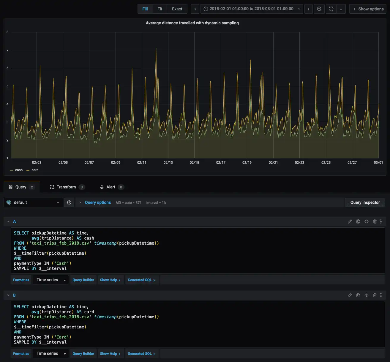
We can see in this graph that the distance traveled by those paying with cards is longer than for those paying with cash. This could be due to the fact that users usually carry less cash than the balance in their card.
Let’s add another panel by selecting Dashboards and + New dashboard:
This time, we will add the following query:
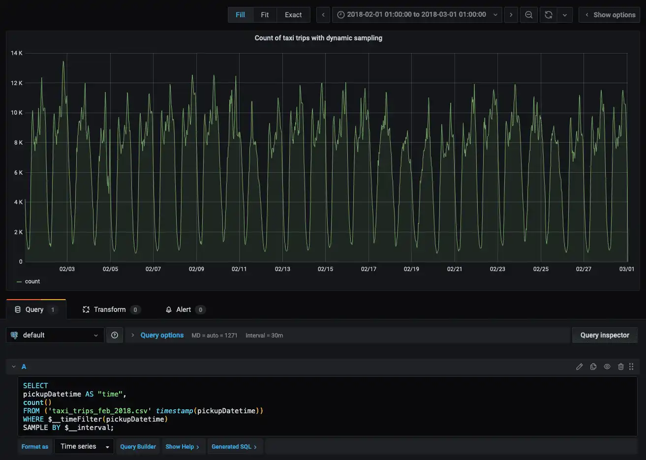
This is what our query looks like when viewing a time range of 28 days:
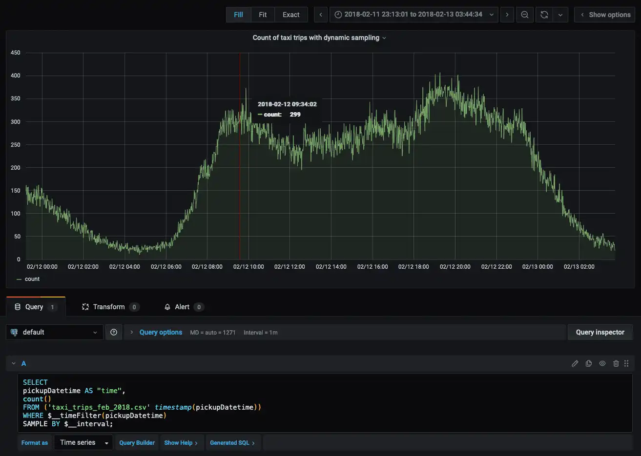
Zooming in to a single day shows more detailed data points as we are sampling by
Grafana's $__interval property:
The daily cycle of activity is visible, with rides peaking in the early evening and reaching a low in the middle of the night.
ASOF JOIN#
ASOF JOIN allows us to join 2 tables based on timestamps that do not exactly
match. To join the taxi trips data with weather data, enter the following query:
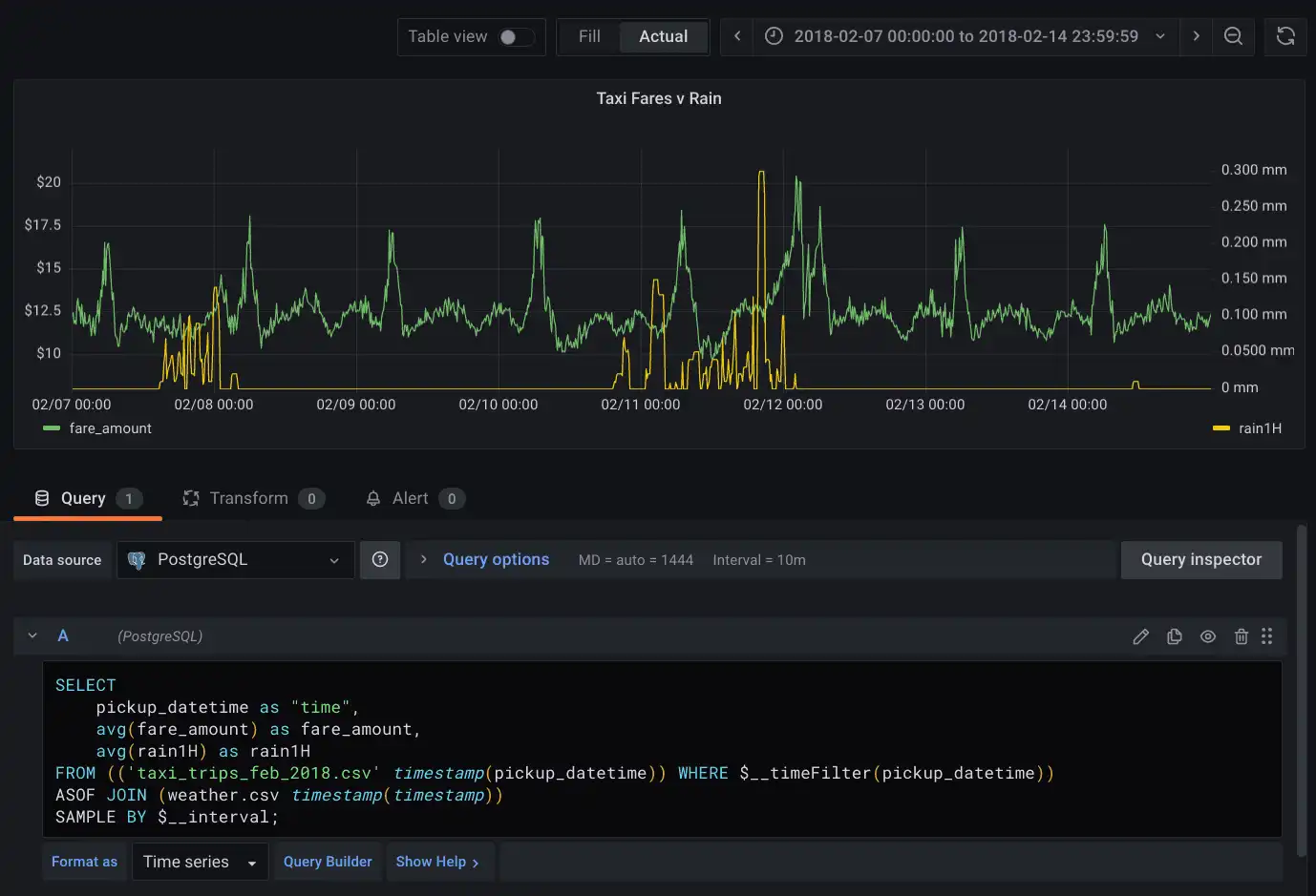
To view a selected week in February 2018, select the time range picker above the chart:
- Set the From value to
2018-02-07 00:00:00 - Set the To value to
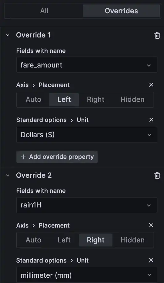
2018-02-14 23:59:59and click Apply time range - Enable dual Y-axis in the option panel by using Overrides, simply
assigning different axis placements and units for fields
fare_amountandrain1H.
In this graph, we have 2 series, in green we have the fare amount sampled dynamically, and in yellow we have the average precipitation per hour in millimeters. From the graph, it’s hard to say whether there is a correlation between rain and the amount spent on taxi rides.
Conclusion#
We have learned how to import time series data into QuestDB and build a dashboard with multiple queries in Grafana. We can use this dashboard to explore the relationship between taxi fares and rainfall, if any. With a dual Y-axis, we can easily compare the two datasets and identify any correlations. Data analysis with a visualization like this can be extremely useful, as it can provide insights into how weather conditions and taxi fares affect each other.
If you like this content and want to see more tutorials about third-party integrations, let us know in our Slack Community.